
Projects

Completed projects and working products

SaaS platforms, AI products, automation, marketplaces and websites built for specific business and product needs.

Each project shows what was built and its current stage.

All work

Projects

A selection of client work, internal products and interface projects.

28 projects
TurbotaAI — TurbotaAI — landing
Working product · in developmentAI products

TurbotaAI

AI SaaS product · Customer app + operations console

Customers sign up, try the AI, subscribe and manage their own data — while the business runs it from an admin console instead of by hand.

Task

An AI demo is not a business. The conversation, the account, the trial limit, the payment, the consent record and the people who operate it all have to work as one product.

What was built

A full AI SaaS: a customer app in three languages with accounts, trial limits, subscription and consent controls — plus an operations console for activation, subscriptions, AI cost, system health and support lookups.

Key features

User accountsSubscription & paywallAdmin & operations consoleRole-based accessConsent & data controlsMultilingual

Tutorivo — Tutorivo — home
Launched MVPSaaS & platforms

Tutorivo

Two-sided marketplace · Education

Students find and filter a verified tutor themselves, tutors apply through a structured form, and the operator decides who gets published.

Task

Tutors and students lived in chats and spreadsheets — no single place to browse by subject and language, apply to teach, or keep requests in order.

What was built

A tutor marketplace: a filterable catalog, tutor profiles, a structured application flow, an admin review layer, lesson-package logic and a multilingual structure.

Key features

Catalog & filtersProfiles & rolesAdmin & moderationPaymentsLesson packagesMultilingual
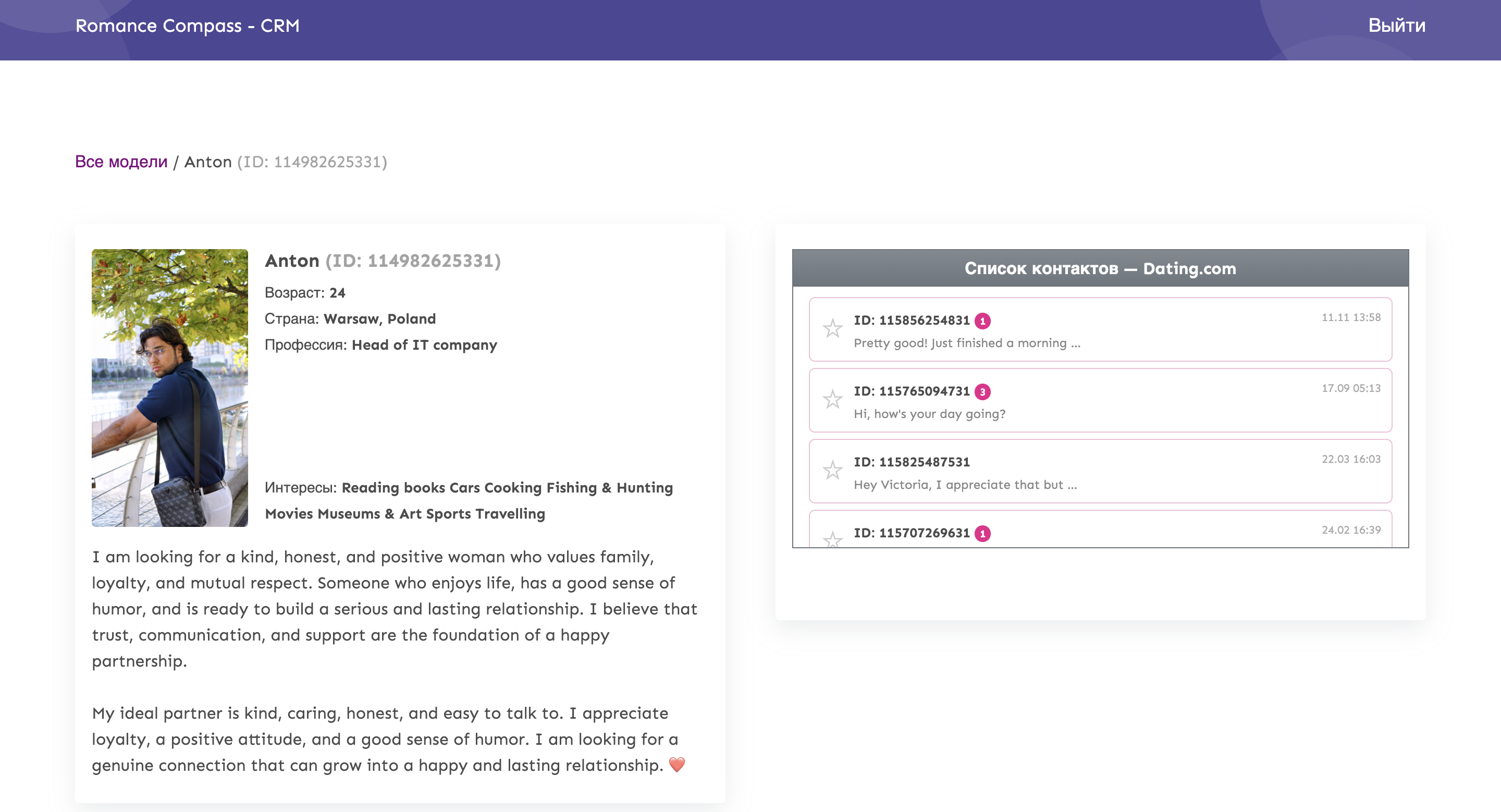
Dating CRM — Romance Compass CRM — profile and conversation workspace
Completed CRM prototypeAutomation & CRM

Dating CRM

CRM + automation · Communication operations

Profiles, conversations and follow-up live in one operator workspace instead of being tracked across disconnected manual steps.

Task

Conversation work depended on manual tracking: an operator had to remember who needed attention, what happened last and when to follow up.

What was built

A CRM prototype with profile context, contact threads, unread-state visibility, follow-up logic and an admin/moderation layer.

Result

The product turns a repeated communication process into a visible operating queue: context stays attached to the profile and the next action is easier to control.

Key features

Profile contextConversation trackingFollow-up logicUnread statesAdmin & moderationOperator workflow
Status Auto — Status Auto — home
Interactive prototypeSaaS & platforms

Status Auto

Vehicle catalog & buyer-request platform

A buyer hands over budget and requirements in one step, so the seller calls back already knowing what to offer.

Task

Car enquiries die in DMs and phone tag — someone browses, has no way to state a budget, and the lead is lost to a slow reply.

What was built

A vehicle catalog with full specifications and a buyer-request flow that captures contact, budget and requirements from any page.

Key features

Inventory / catalogLead captureQualified request formConversion routing

AI voice assistant

Voice assistant for incoming calls

The assistant answers the first contact in natural speech, handles the opening conversation and routes the request to the right next step.

Working audio demoAI products

Ikorka AI Voice Assistant

Voice AI · Call answering

Calls get answered and routed in natural speech instead of going to voicemail.

Task

Calls go unanswered and callers aren't routed to the right place fast enough.

What was built

A voice assistant that answers and routes callers in natural speech — with a working audio demo.

Key features

Voice AICall answeringCall routing
SerCrypto Academy — SerCrypto Academy — landing hero
Launched client websiteWebsites

SerCrypto Academy

Conversion landing · Live client project

A live public page that presents the offer clearly and moves visitors along one route: understand it, then register.

Task

The brand needed a clear public landing that presents its offer and routes visitors toward registration.

What was built

A responsive public landing: information architecture, offer and access presentation, and a single conversion route to registration.

Key features

Landing IAResponsive webOffer presentationConversion route
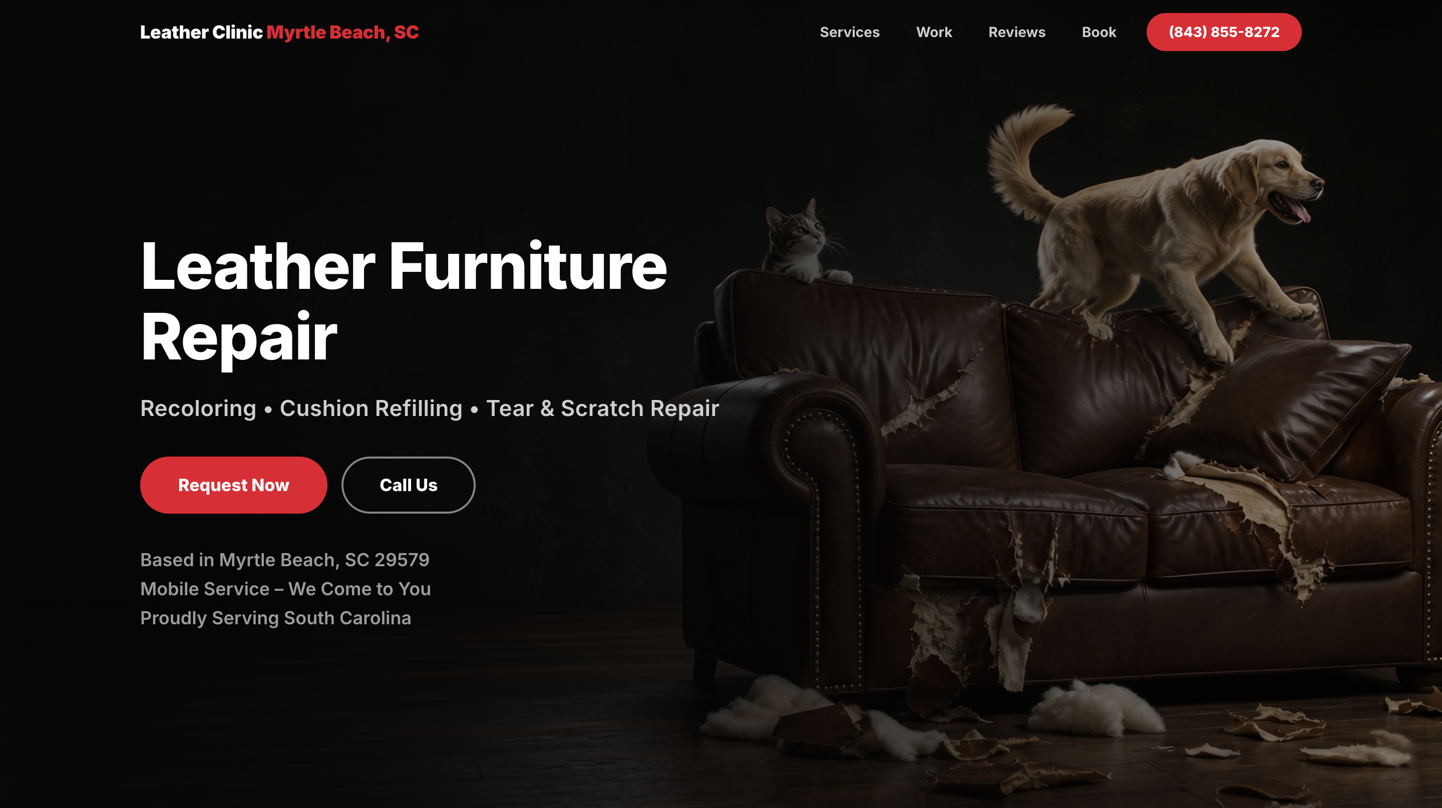
Leather Clinic Myrtle Beach — Leather Clinic Myrtle Beach — live website hero
Launched client websiteWebsites

Leather Clinic Myrtle Beach

Live local-service website · Lead generation

A visitor lands on one clear service promise, immediately sees the local coverage and can move straight to a request or phone call.

Task

A specialist local service needs to explain what is repaired, where the team works and how to request help before a visitor loses intent.

What was built

A focused service website with a visual hero, repair categories, local positioning, proof-oriented sections and direct Request / Call paths.

Result

The interface removes navigation friction from the highest-intent journey: understand the offer, confirm the service area, then contact the business.

Key features

Local-service positioningConversion landingRequest CTAClick-to-callResponsive UIService architecture
Coastal Mobile Boat Detailing — Coastal Mobile Boat Detailing — live hero
Launched client websiteWebsites

Coastal Mobile Boat Detailing

Live service website · Boat, car & RV detailing

The first screen tells a local visitor exactly what is restored, where the mobile service works and how to call or schedule.

Task

A broad detailing service can feel generic unless the site quickly anchors the core transformation, service area and booking action.

What was built

A live service site centred on Surface Restoration & Protection with a mobile-service proposition, service list, phone CTA and appointment CTA.

Result

The page turns a wide service menu into one coherent high-intent journey for local traffic.

Key features

Local-service websiteOffer hierarchyCall CTAAppointment CTAService catalogResponsive landing
COD Power Group — COD Power Group — platform and dashboard
Platform projectSaaS & platforms

COD Power Group

Ecommerce operations platform · Cash on delivery

One place to run cash-on-delivery selling end to end — orders, stock, couriers, call-centre confirmations and payouts — instead of a spreadsheet per country.

Task

Cash-on-delivery sellers lose money in the gap between the order and the doorstep: unconfirmed leads, stock nobody tracks, courier statuses in four dashboards and payouts reconciled by hand.

What was built

A marketing site plus an operations dashboard: orders, stock, invoices, sourcing requests, lead sources, call-centre confirmation stats, shipping status across couriers, and seller / affiliate account models.

Key features

Orders & stockCall-centre pipelineCourier trackingInvoicingSeller & affiliate rolesAnalytics
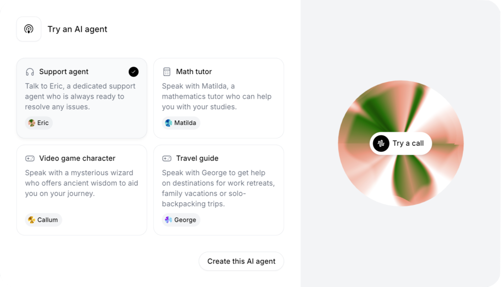
AI Agent Voice Playground — AI Agent Voice Playground — agent selection and call entry
Interactive AI prototypeAI products

AI Agent Voice Playground

AI product UX · Multi-agent voice interface

A user can understand the available agent roles, select a use case and move into a voice-first interaction without learning an AI tool first.

Task

A multi-agent product becomes confusing when users see technology instead of clear roles and outcomes.

What was built

A clean agent-selection interface with use-case cards, named agent personas and a dedicated voice-call entry point.

Result

The UX turns an abstract 'AI agents' concept into concrete jobs: support, tutoring, games and travel guidance.

Key features

Agent catalogVoice-first UXRole-based agentsUse-case cardsCall entry flowProduct prototyping
Telegram Mini App — Mining — Telegram Mini App — core screens
Completed projectMobile & Telegram

Telegram Mini App — Mining

Telegram Mini App concept · Rewards & referrals

A product that lives inside Telegram: users come back on a timer, invite friends for a share of their activity, and upgrade a paid package without ever installing an app.

Task

Acquisition is expensive and app installs are a wall. A Mini App removes the install, but only earns attention if there is a reason to return and a reason to invite.

What was built

A Telegram Mini App: a collection timer with a claim action, a finance area for top-up and withdrawal, a referral system paying a share of invited users' activity, and a shop of upgradeable packages.

Key features

Telegram Mini AppReturn timer & rewardsReferral systemTop-up & withdrawalPaid upgrades
UN AMOUR — UN AMOUR — storefront
Completed projectEcommerce

UN AMOUR

Fashion ecommerce · Ukrainian womenswear brand

An online store that sells a considered garment the way a boutique does — the piece first, the price plainly, and a route to the catalogue that never makes the buyer hunt.

Task

Clothing brands lose the sale between the photo and the checkout: unclear collections, prices that hide, and a catalogue that reads like a folder rather than a shop.

What was built

A bilingual storefront: an editorial home, a bestseller carousel with prices, a wedding and evening collection section, catalogue navigation, search and cart.

Key features

Storefront & catalogueBestseller merchandisingCollectionsBilingual UA/ENSearch & cart
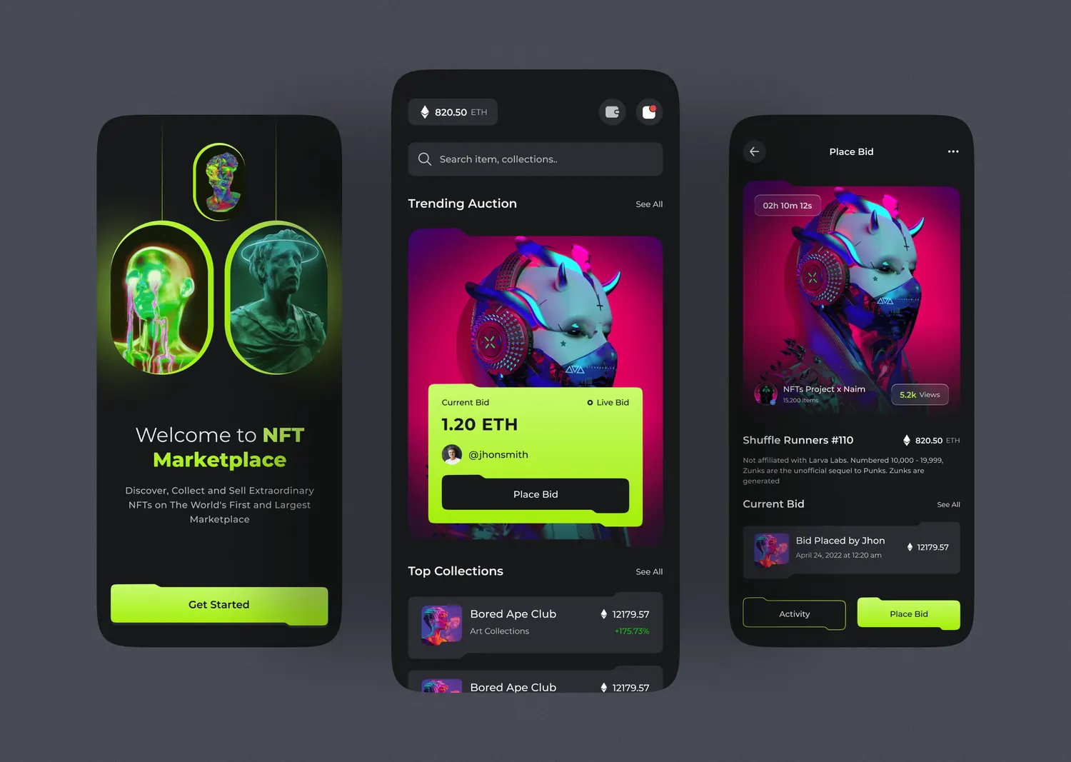
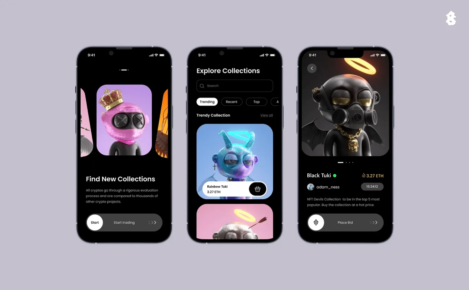
NFT Live Auction — NFT marketplace — live auction and place-bid flow
Completed projectMobile & Telegram

NFT Live Auction

Mobile marketplace surface · Live bidding

The highest-friction marketplace moment is reduced to one focused screen: current state, time pressure, bid context and a clear action.

Task

A bidding flow fails quickly when price, countdown, history and the place-bid action compete instead of forming one decision hierarchy.

What was built

A mobile live-auction concept with current bid context, countdown, bid history and a focused place-bid interaction.

Result

The transaction moment is treated as a dedicated product flow rather than another content card.

Key features

Live bidding UXAuction stateCountdownBid historyTransaction flowMobile UI
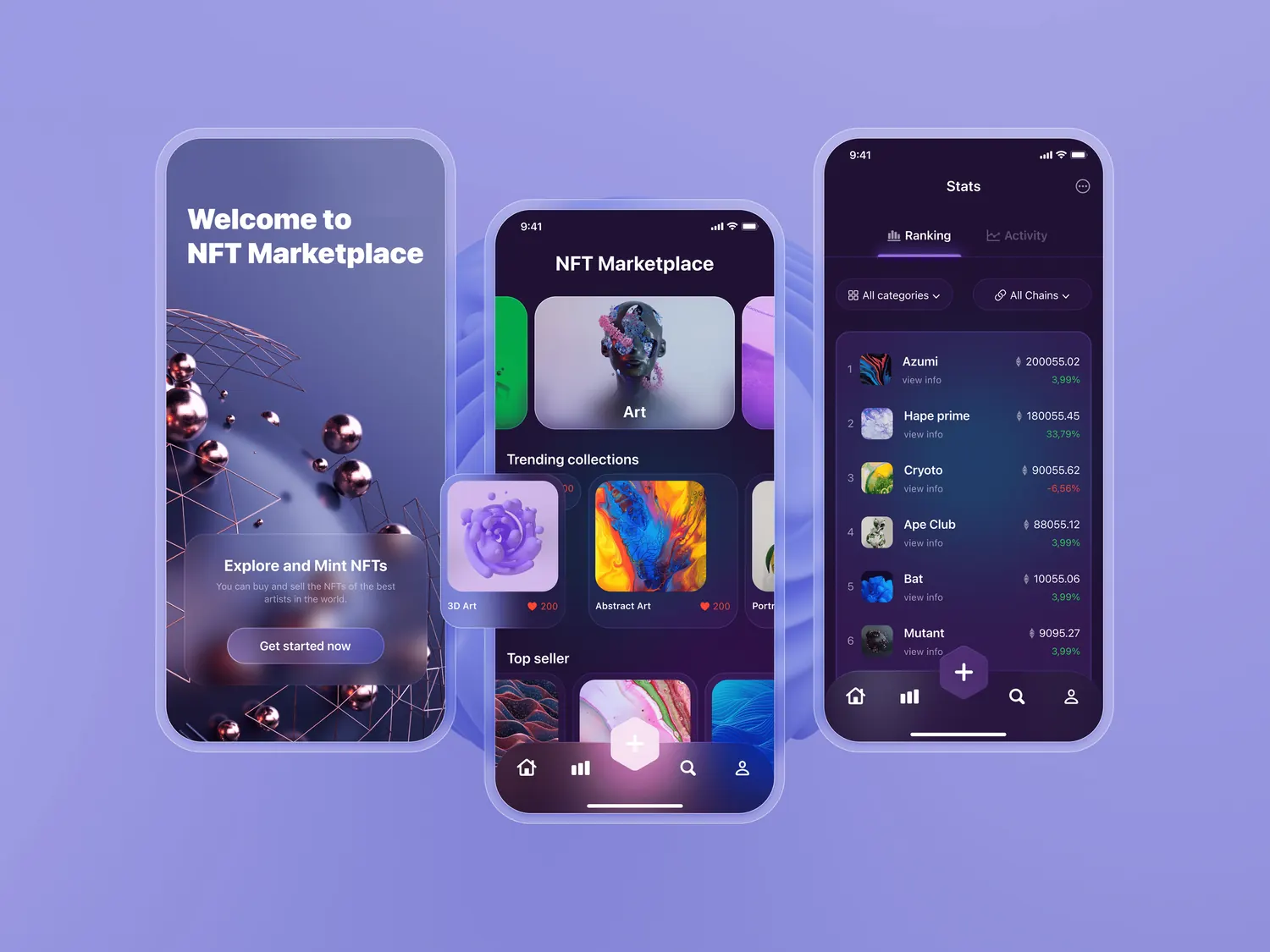
NFT Discovery — NFT marketplace — discovery surface
Completed projectMobile & Telegram

NFT Discovery

Mobile marketplace surface · Discovery

A discovery-first mobile surface helps a collector scan what is worth opening before entering a specific asset or auction.

Task

Marketplace discovery becomes noisy when collections, creators and assets compete for attention without a clear browsing hierarchy.

What was built

A focused discovery experience using visual hierarchy, grouped marketplace content and mobile-first navigation.

Result

This separates the browsing problem from the transaction problem so each part of the marketplace can be validated independently.

Key features

Marketplace discoveryMobile UXContent hierarchyCollection browsingNavigationProduct concept
NFT Collections — NFT marketplace — collections surface
Completed projectMobile & Telegram

NFT Collections

Mobile marketplace surface · Collections

A collection-focused screen gives assets a coherent context instead of presenting every item as an isolated tile.

Task

Collectors need to understand a group before drilling into a single asset; flat grids lose that relationship.

What was built

A collection browsing surface that groups assets into a recognisable marketplace structure and keeps the mobile hierarchy compact.

Result

The collection becomes a navigable product object, not just a visual label above a grid.

Key features

Collection UXAsset groupingMobile hierarchyMarketplace UINavigationProduct concept
IKO — Blockchain for business · B2B site
Completed projectWeb3 & fintech

IKO

Blockchain for business · B2B site

Blockchain explained to a business buyer in terms of trust and paperwork, not protocols.

Task

B2B blockchain sites talk to engineers and lose the person who signs. The buyer never learns what changes in their operation.

What was built

A B2B site translating the technology into business outcomes — a secure-and-safe section, a trust argument, and an enterprise-facing contact route.

Result

Positions a deep-tech product for a commercial audience so the first meeting is about outcomes, not architecture.

Key features

B2B positioningTrust architectureEnterprise landing
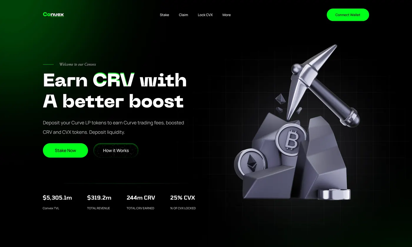
Convex Staking — DeFi staking product · Yield & audit
Completed projectWeb3 & fintech

Convex Staking

DeFi staking product · Yield & audit

A staking product where the yield, the withdrawal terms and the security audit are visible before anyone deposits.

Task

Depositing into a yield product is irreversible. If the boost mechanism, the withdrawal rules and who audited the contracts are not on the first screen, a cautious depositor leaves.

What was built

A staking landing presenting deposits for boosted yield, explicit withdrawal terms, the token model and a named third-party security audit.

Result

Puts the three questions a depositor actually has — what do I earn, when can I leave, who checked this — above the fold.

Key features

Staking & yield UXWithdrawal termsAudit framingToken presentation
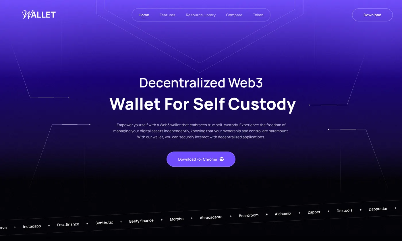
Self-Custody Wallet — Web3 wallet · Swap & custody
Completed projectWeb3 & fintech

Self-Custody Wallet

Web3 wallet · Swap & custody

A wallet that answers "who holds my assets" before it asks anyone to connect.

Task

Self-custody is the whole promise, and most wallets bury it. Users cannot tell what is collected, who audits the code, or what happens if the company disappears.

What was built

A wallet product with swap and source/destination network selection, buy-crypto and add-chain entry points, plus explicit transparency and security sections covering open source, regular audits and what data is never collected.

Result

Treats custody, fees and data collection as primary interface content — the thing that earns the connect — rather than footnotes.

Key features

Wallet & swap UXNetwork selectionTransparency & securityOnboarding
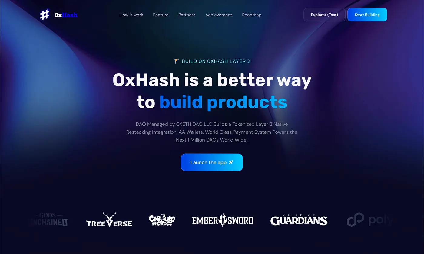
0xHash — Layer-2 chain · Developer platform
Completed projectWeb3 & fintech

0xHash

Layer-2 chain · Developer platform

A Layer-2 positioned to builders: what it costs, what it connects to, and how to get funded to build on it.

Task

Chains compete for developers, not end users. A builder decides in one screen whether the fees, interoperability and routing are worth rewriting for — and whether anyone will fund the attempt.

What was built

A chain site covering core features around fees and scalability, interoperability and blockchain routing, an ecosystem showcase and a builder grant path.

Result

Turns an infrastructure product into a recruiting page for the only audience that grows it: the people who ship on it.

Key features

Developer positioningEcosystem showcaseGrant funnelTechnical clarity
CarLuxe — Car detailing · Service website
Completed projectWebsites

CarLuxe

Car detailing · Service website

A detailing service where the packages are priced and comparable instead of quoted on request.

Task

Service businesses hide behind "contact us for a quote", so the customer cannot compare and does not call. Meanwhile the competitor who published a price list gets the booking.

What was built

A service website with a dark automotive hero, service tiers presented as packages across exterior, interior and full detailing, and a booking route.

Result

Turns an enquiry-only service into something a customer can choose from the page — which is the difference between a lead and a booking.

Key features

Service websitePackage presentationBooking routeAutomotive art direction
PURE — Electric mobility · Product landing
Completed projectEcommerce

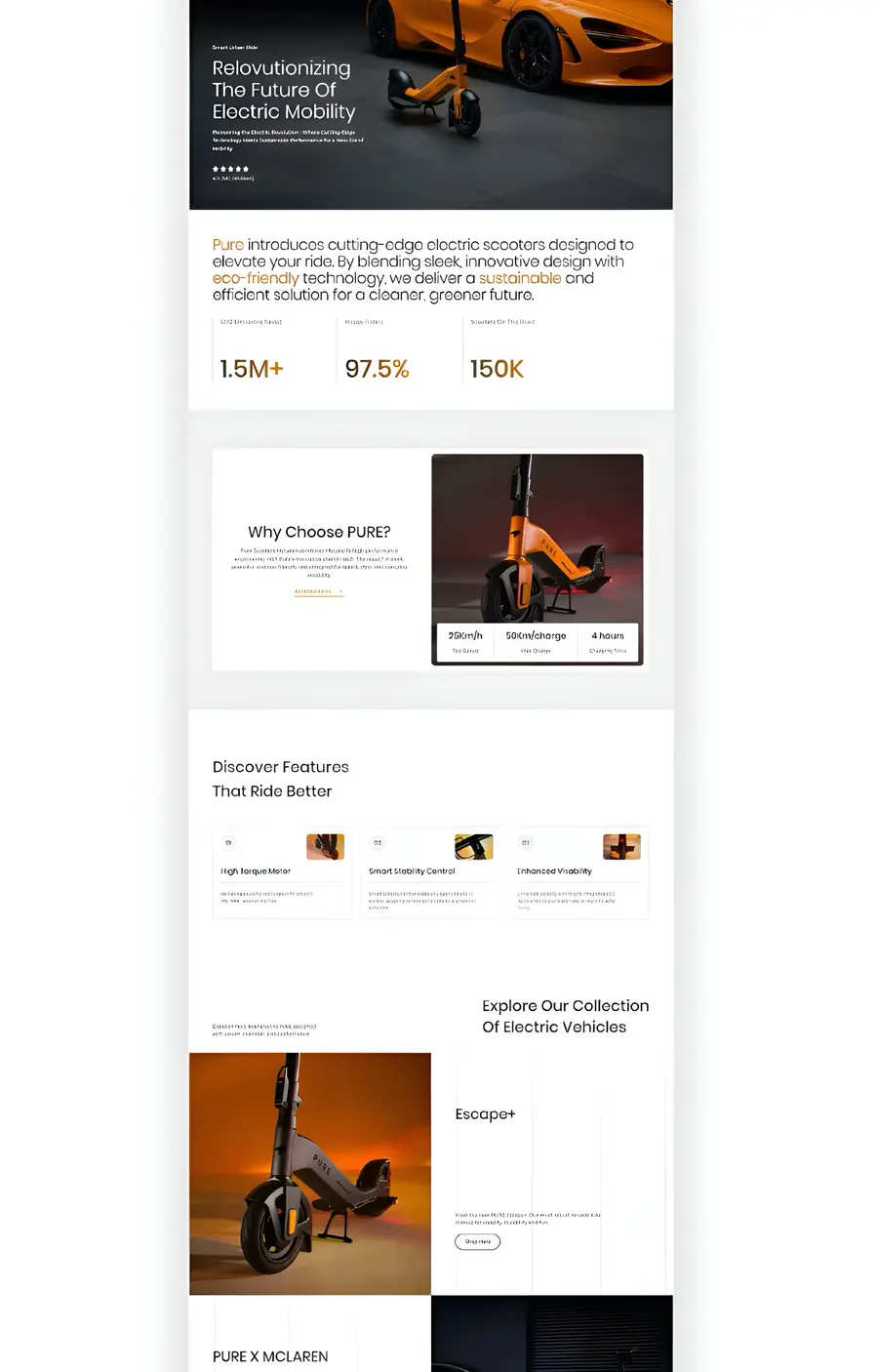
PURE

Electric mobility · Product landing

An electric scooter range where the models are actually comparable before the buyer commits.

Task

Electric mobility is a considered purchase with real anxiety attached — range, build quality, what happens after the sale. A page that lists specifications without comparing them leaves the buyer to do the work, and most will not.

What was built

A product landing introducing the range, a why-choose-us argument, feature discovery, and a model comparison leading into the collection.

Result

Moves the buyer from curiosity to a specific model, which is the only step that ends in a purchase.

Key features

Product landingRange comparisonFeature discoveryConsidered-purchase UX
KINEX — Wearable device · Product landing
Completed projectEcommerce

KINEX

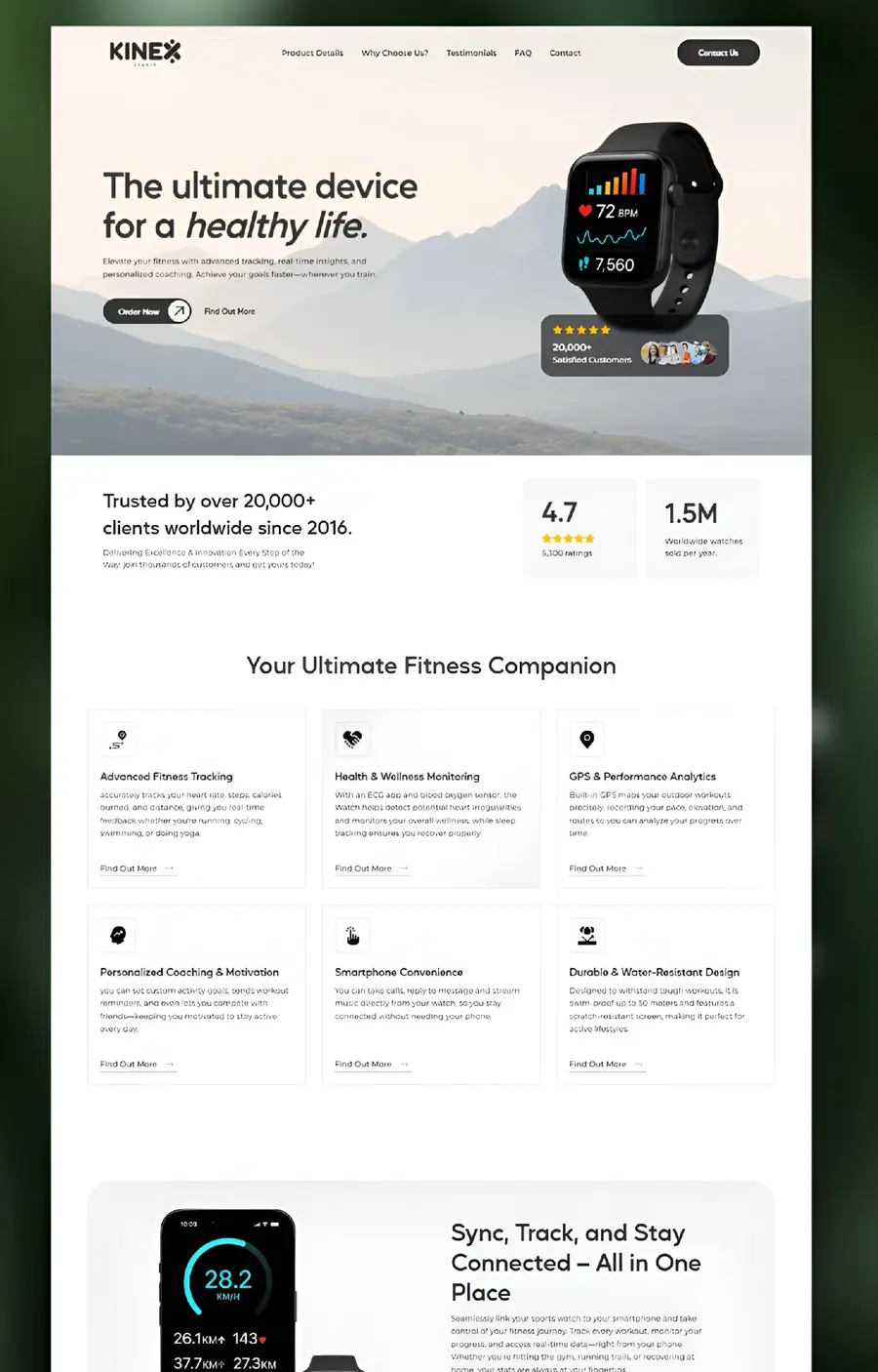
Wearable device · Product landing

A fitness wearable sold on what it tells you, not on how many sensors it has.

Task

Wearables all list the same specifications. The buyer cannot tell them apart, so the category collapses into a price comparison.

What was built

A device landing with a product hero, a feature breakdown across training, health monitoring and analytics, and an in-use section showing the device reporting real activity.

Result

Sells the daily moment of use rather than the hardware, which is the only thing that differentiates one wearable from another.

Key features

Device landingFeature architectureIn-use storytellingSpec-to-benefit translation
Velora — Furniture brand · Ecommerce catalogue
Completed projectEcommerce

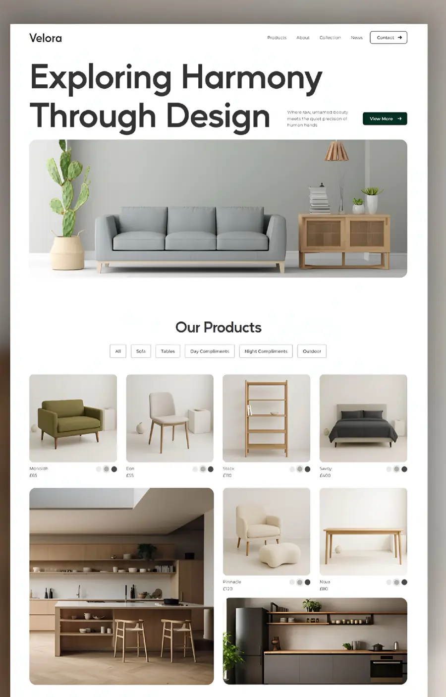
Velora

Furniture brand · Ecommerce catalogue

A furniture catalogue a person can browse by room rather than by SKU.

Task

Furniture is bought by imagining it in a space. A grid of cut-out products on white gives the buyer nothing to imagine with, and the sale moves to whoever shows the room.

What was built

An ecommerce storefront with an editorial hero, a filterable product catalogue across seating, tables and storage, room-context photography and a contact route.

Result

Sells the room, then the item — which is how a considered furniture purchase actually forms.

Key features

Ecommerce catalogueCategory filteringRoom-context merchandisingEditorial storefront
Auréa — Skincare brand · Ecommerce landing
Completed projectEcommerce

Auréa

Skincare brand · Ecommerce landing

A face oil sold on ingredients and result rather than on adjectives.

Task

Skincare buyers are sceptical and informed. A page of soft photography and vague promises gives them nothing to decide with, so they leave before the price.

What was built

A conversion landing with a product hero, an ingredient-and-benefit breakdown, a route into the range, and brand product photography as the supporting layer.

Result

Puts the reason to buy — what is in it and what it does — between the photograph and the price, which is where the decision actually happens.

Key features

Conversion landingIngredient storytellingProduct merchandisingBrand art direction
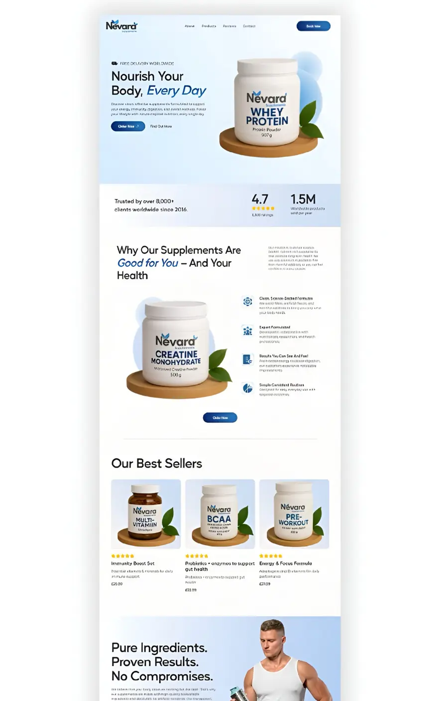
Nēvard — Supplements brand · Ecommerce system
Completed projectEcommerce

Nēvard

Supplements brand · Ecommerce system

A supplement range where every product page is built from the same trusted skeleton.

Task

Supplements live or die on trust, and a range multiplies the problem: each new SKU needs the same proof rebuilt, so quality drifts and the brand starts to look inconsistent.

What was built

A reusable product-page system applied across whey protein and creatine — product hero, a why-it-is-good-for-you argument, ingredient and usage detail, and a best-sellers grid.

Result

One structure that any new product drops into, so the brand scales its catalogue without rebuilding credibility each time.

Key features

Reusable page systemSupplement compliance framingRange scalingBestseller merchandising
Bonatica — Skincare brand · Ecommerce landing
Completed projectEcommerce

Bonatica

Skincare brand · Ecommerce landing

A skincare range where each product states who it is for before it states what it costs.

Task

A range confuses more than a single product. Without a clear reason to pick one item over its neighbour, the buyer picks nothing.

What was built

A range-led landing: the hero introduces the line rather than one item, a why-it-works section grounds each claim in an ingredient, and a best-sellers grid splits the range by the need it answers.

Result

Turns a shelf of similar bottles into a guided choice, which is what converts a browsing visitor into a first order.

Key features

Conversion landingRange segmentationIngredient argumentBestseller merchandising
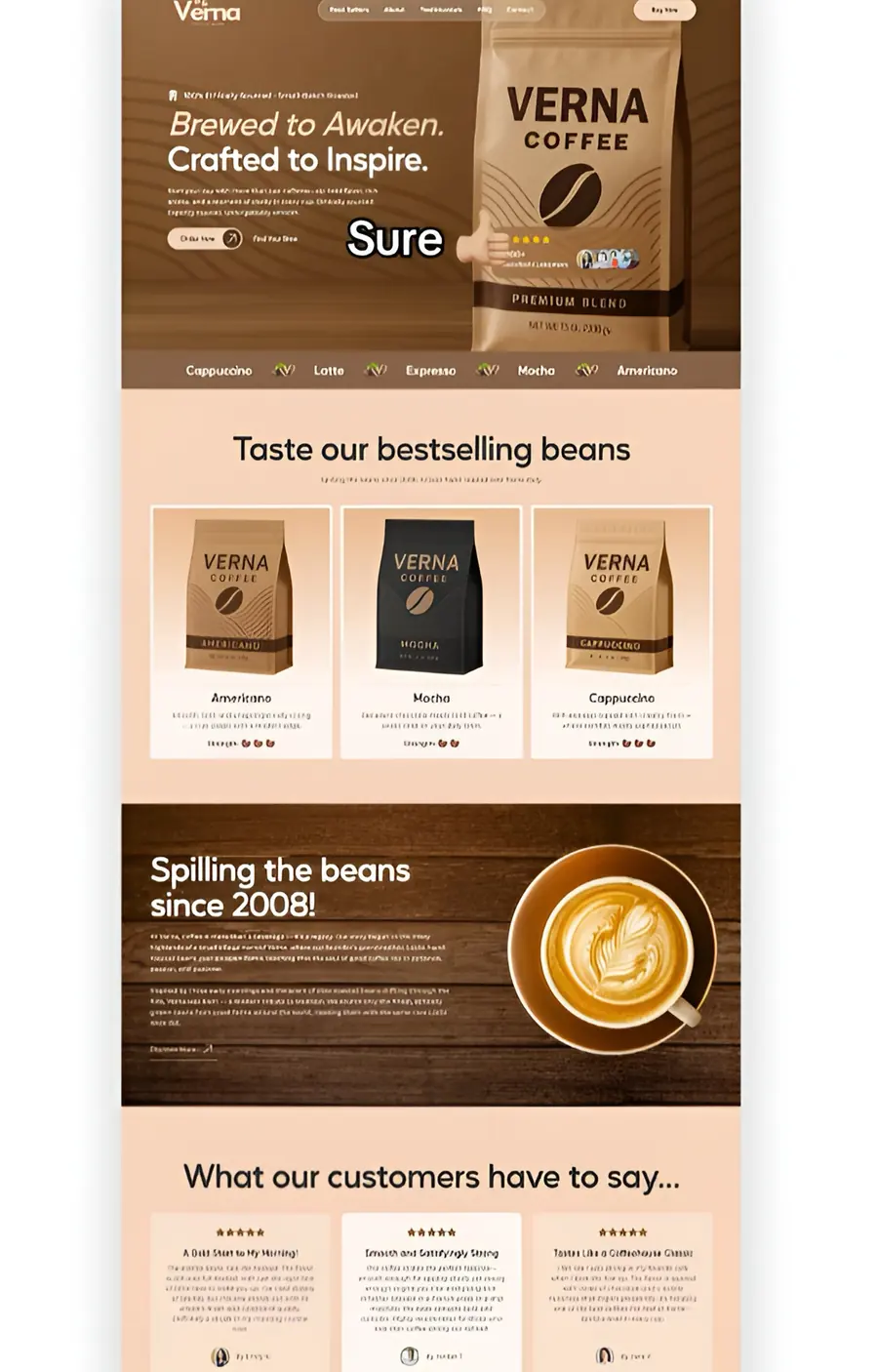
VERNA Coffee — Coffee brand · Ecommerce landing
Completed projectEcommerce

VERNA Coffee

Coffee brand · Ecommerce landing

A coffee range where roast, format and taste are chosen in one pass instead of three.

Task

Coffee buyers know what they like and hate being made to guess. Hiding roast level and format behind product pages turns a quick reorder into a chore.

What was built

A brand landing with a bestseller range showing roast variants and formats side by side, a brand story section and a lifestyle layer.

Result

Shortens the path to a repeat order, which is where a coffee brand's economics actually live.

Key features

Ecommerce landingVariant presentationBrand storytellingRepeat-purchase UX
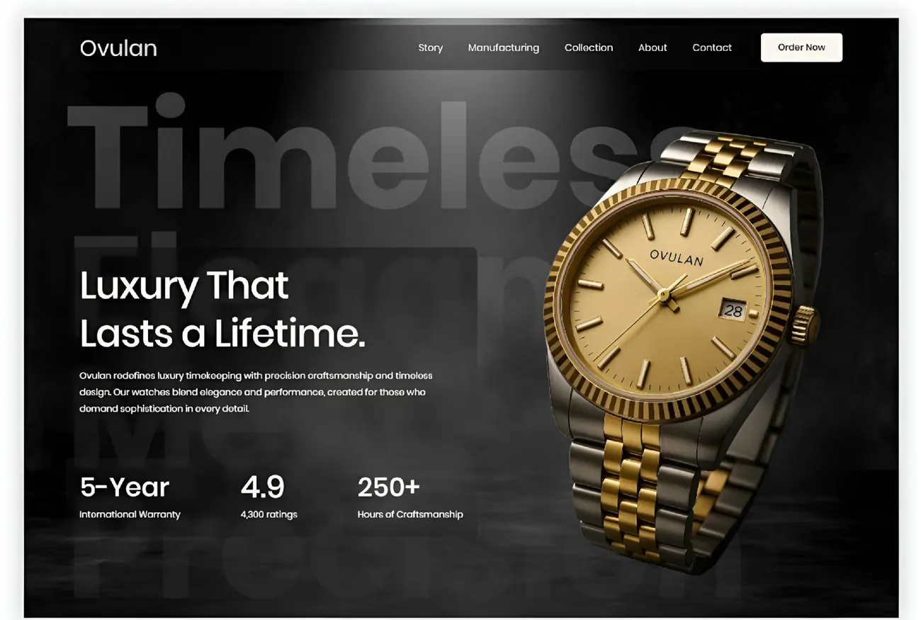
Ovulan — Luxury watches · Ecommerce landing
Completed projectEcommerce

Ovulan

Luxury watches · Ecommerce landing

A watch brand that earns its price on the first screen instead of apologising for it.

Task

At a luxury price point the objection is not cost, it is doubt. If warranty, craftsmanship and provenance are not immediate, the buyer assumes they are absent.

What was built

A luxury storefront with a dark editorial hero, warranty and craftsmanship credentials placed immediately under the headline, a collection grid and a brand-story section.

Result

Answers the doubt that stops a high-ticket purchase, which is worth more than any discount.

Key features

Luxury art directionCredibility architectureCollection presentationHigh-ticket UX

Portfolio

Have a product or process you want to improve?

Tell me what you want to build or improve. I’ll suggest the most practical starting point and format.